- Home
- Task 1 Lessons & Tips
- Writing IELTS Line Graphs
Lesson on Writing IELTS Line Graphs
In this lesson on writing IELTS line graphs we'll look at the stages you need to go through to write an effective response to get a high score.
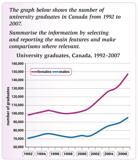
We'll look at a fairly easy question in order to do this. Take a look at this example:

The Planning Stage
Review the visuals and question
Read through the question quickly and have a look at the visual for a basic understanding. This quick review allows you to get a general overview of the question. When we do this with the question above we see it’s a question about male and female graduates and that the trend is upwards overall.
Identify the key points
Analyse the visual more deeply and identify and note the key features of the visual. For instance, when we look at the graph in the question with a more critical eye we can see that the features of the graph are:
- More women than men graduated from Canadian universities
- There has been a large increase in graduates since 2001
- Levels of graduates for both men and women stayed roughly the same between 1992-2001
- The gap between the sexes has also increased from the start to the end of the period (30k - 50k).
- They both follow similar patterns (fluctuating slightly then increasing)
These things you have identified are key features of the line graph so you'd need to make sure they are covered in your response at some point.
Identify your comparison points
The question always asks you to make comparisons. In most questions there are some options on what you should compare and its important that you choose the options that will ensure your response is coherent and easy to follow.
The key points you identified above reveal various points of comparison e.g. the gaps between females and males widening after 2001.
Organisation: determine your paragraphs

Once you have your key points and have determined some appropriate comparisons, the next stage in writing IELTS line graphs is to identify how you are going to break your paragraphs up.
There are usually several options rather than there being one right or wrong answer. For instance you could choose to have one paragraph about females and another about males.
This could work ok but a potential problem is that it could be more difficult to compare the two groups because when you start on your second body paragraph about the second group (e.g. males) at 1992 again, the person reading it will have to remember what you said in 1992 about the first group (females).
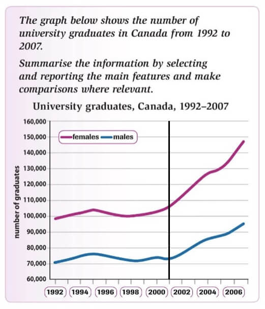
In the case of our question, there is an obvious way to group the information and that is by drawing a line in 2001. As well as being a mid-point, it is also the start point of significant change in the graph so it makes perfect sense to cut off here. In other words have one body paragraph about 1992-2001 and a second body paragraph about the rest of the period.
The Writing Stage
Write your Introduction
Now its time to actually start writing. There are two steps we need to follow to do this
- Go back and review the question and graph again as your first sentence with be a reworking of the original question. Make sure you change the verbs, and try to rephrase each element. You will often find there is additional information on the graph that wasn’t included in the original question. Include it now.
- Select one or two of your main points and write a short sentence for each to be included after the introduction sentence. This often called an overview. You can also use one complex sentence rather than two simple sentences if you are feeling adventurous.
For example, the wording in the question is this:
The graph below shows the number of university graduates in Canada from 1992 to 2007.
So our rephrasing may look something like this:
The graph details the level of male and female graduates in Canadian universities between 1992 and 2007.
As you can see we have changed the verbs here, introduced new information from the graph (male and female) and rephrased the topic and the timeline. Now time to select and add our key points. This could look as follows:
Whilst there was a large increase in graduates since 2001, the gap between the number of men and women also increased.
This gives us a final introductory paragraph of
The graph details the level of male and female graduates in Canadian universities between 1992 and 2007. Whilst there was a large increase in graduates since 2001, the gap between the number of men and women also increased.
Write body paragraph 1
Here we outline the key points based on how we determined the paragraphs. When you decide upon your main point, you should lay this out in your topic sentence. This should then be followed by some data to demonstrate your point in sentences 2 and 3.
For example, we determined in our task that it would be better to split the graph in 2001, so the main point of this paragraph is going to be a steady level of graduates and ratio of males and females.
Our opening sentence may look something like this:
The level of men and women graduating from Canadian universities remained relatively stable between 1992 and 2001.
Now we need to provide some data to back up this point:
In this time period, the level of female graduates fluctuated between 100,000 in 1992 and 103,000 in 2001, a pattern almost identical to that of male graduates. Male graduates, though, started at a much lower rate, 70,000, and reached maximum highs of around 75,000 up until 2001.
This gives us a first body paragraph of:
The level of men and women graduating from Canadian universities remained relatively stable between 1992 and 2001. In this time period, the level of female graduates fluctuated between 100,000 in 1992 and 103,000 in 2001, a pattern almost identical to that of male graduates. Male graduates, though, started at a much lower rate, 70,000, and reached maximum highs of around 75,000 up until 2001.
Write body paragraph 2
Repeat the last step for paragraph 2 based on the structure your determined in step 4.
For example, in our task, the second body paragraph is about 2001-2007. Again, we need to place the main feature/features up front.
There was a large increase in the level of both male and female graduates in Canadian universities between 2001 and 2007 but the increase was more pronounced among women.
Note this actually combines the two key points we used in the introduction. We now need to add the data:
The level of women graduates jumped from around 105,000 in 1992 to nearly 150,000 by 2007, whereas for men the increase was slightly less significant, with an increase from around 75000 in 2001 to just over 96,000 in 2007.
This gives us the final piece in the puzzle of writing IELTS line graphs. Our task 1 text is now:
Full Sample Answer
The graph details the level of male and female graduates in Canadian universities between 1992 and 2007. Whilst there was a large increase in graduates since 2001, the gap between the number of men and women also increased.
The level of men and women graduating from Canadian universities remained relatively stable between 1992 and 2001. In this time period, the level of female graduates fluctuated between 100,000 in 1992 and 103,000 in 2001, a pattern almost identical to that of male graduates. Male graduates, though, started at a much lower rate, 70,000, and reached maximum highs of around 75,000 up until 2001.
There was a large increase in the level of both male and female graduates in Canadian universities between 2001 and 2007 but the increase was more pronounced among women. The level of women graduates jumped from around 105,000 in 1992 to nearly 150,000 by 2007, whereas for men the increase was slightly less significant, with an increase from around 75,000 in 2001 to just over 96,000 in 2007.
Words: 170

Review and Edit
Review and edit your text for errors, awkward phrases and improvement. But don’t go nuts!
The Language
You'll have noticed that when writing IELTS line graphs you use both language for comparing and contrasting (e.g. whilst; identical; much lower; whereas) and the language of change (e.g. large increase; relatively stable; fluctuated; reached maximum highs).
Using this language correctly and varying your lexis is also critical to getting a high score, as is making use of mix of sentences structures (i.e. simple, compound, complex).
We'll not go into detail about this as it's been covered in other lessons, so check those out here if you want to learn more:
Comments
Any comments or questions about this page or about IELTS? Post them here. Your email will not be published or shared.


