- Home
- Sample Graphs
- Task 1 Pie Chart
Task 1 Pie Chart
This task 1 pie chart includes four pie charts that need to be compared. It's also set partly in the future so you need to think about the language that you will use.
Analysing the Pie Chart
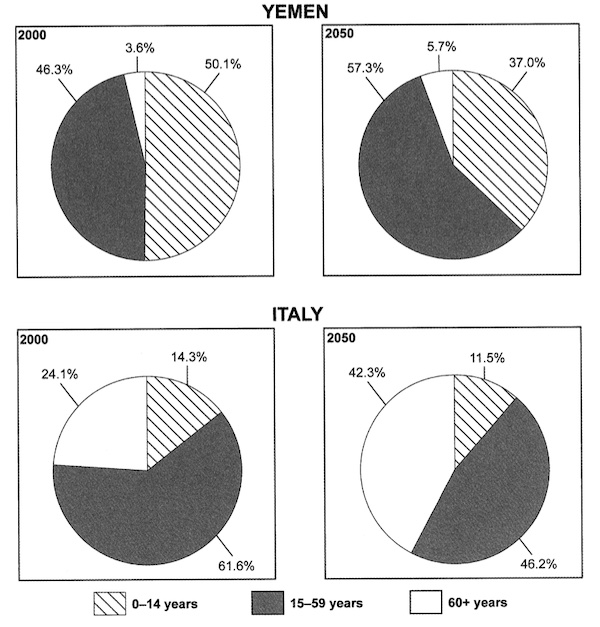
If you look at the pie chart, you'll see that there are two countries to compare.
You need to make sure that you make comparisons as you are asked to do this in the prompt.
Remember to look for the important data/changes to place into your overview.
Very important is also the fact that the graph is in the future (learn more about graphs in the future). So you need to make use of future tenses, not just the past tense.
Now take a look at the model answer.
Task 1 Pie Chart Example
You should spend about 20 minutes on this task.
The charts below give information on the ages of the populations of Yemen and Italy in 2000 and projections for 2050.
Summarise the information by selecting and reporting the main features, and make comparisons where relevant.
Write at least 150 words.

Model Answer
The bar charts compare three age ranges of people in Yemen and Italy for the year 2000 and predictions for 2050. While Yemen will see the domination of 0-14 year olds in their population overtaken by 15-59 year olds in 2050, the dominant population in Italy, 15-59 years olds, remains the same over the period, albeit at a far lower percentage by 2050.
In 2020, while 0-14 year olds made up just over half of the population in Yemen, this accounted for only 14.3% of Italy’s population. The predominant age group in Italy was those aged 15-59, at 61.6%, and in Yemen this group was also fairly large, at 46.3%. In Yemen, the 60+ age group was very small, representing just 3.6% of the overall population. In contrast, this group made up just under a quarter of people in Italy.
By 2050, the population composition in Yemen will have changed noticeably, with 15-59 year olds expected to replace the younger age group as the dominant category, at 57.3% and 37% respectively. The 60+ age range will experience only a slight increase. However, in Italy, it is the 60+ age group that is predicted to see the greatest change, rising to just over 42%. Unlike Yemen, the greatest change will be seen in the percentage of those over 60, rising to 42.3%. The 0-14 group will see a slight fall.
(236 Words)
Comments
The task 1 pie chart response is well-organised. The graph is introduced and then an overview is given.
Yemen and Italy in 2000 are presented, followed by how they have changed in 2050. It could be organised differently if you wanted. For example, you could discuss Yemen first in 2020 and 2050 then compare it to Italy. There are usually several options for the organisation - the important thing is that it is logical and clear.
The task 1 pie chart also makes good comparisons between the countries and years. It's always important to make comparisons between the features you are presented with. Data is also appropriately selected to support the points.
There is also good use of language. The language for the data is varied, with not only the actual percentages used, but also other words, such as 'quarter' and 'half'. There is language showing change (e.g. slight increase, rising to) but also language to make comparisons (e.g. far lower, in contrast, unlike).
Importantly, both the past and future tenses are used. For instance, these future phrases are used to discuss 2050:
- will see
- will have changed noticeably
- expected to
- is predicted to
There is also a good mix and range of complex forms and structures present in the response.
Comments
Any comments or questions about this page or about IELTS? Post them here. Your email will not be published or shared.
Band 7+ eBooks
"I think these eBooks are FANTASTIC!!! I know that's not academic language, but it's the truth!"
Linda, from Italy, Scored Band 7.5
