IELTS Computer Delivered Tests + Band Score

IELTS Line Graph - Employment Patterns in the USA

by Hura
(Hanoi, Viet Nam)

USA labour inforcement

USA labour inforcement

Hello everyone!

I have to say that: this has been the first time i try writing an IELTS writing task 1. I am sure that I have made a lot of mistake. However, I still write it down here. Can you and other readers help me incorrect and improve it? Thank you so much!

Here is my paragraph (I tried it in about 25 minutes)


Answer

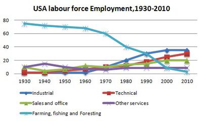
The given graph illustrates the employment patterns over a 70 year timescale in the USA.

In 1930, the USA labor force concentrated on farming,fishing and foresting, while the employment of industry, sales and offices, technology and other services were at such a low percentage. However, through 70 years, the number of employee in farming, fishing and foresting decreased dramatically in contrast of sales and offices, industrial and technical ones.

There was over 75% labor force in farming, fishing and foresting in 1930. But it started to drop down gradually until 1970 and significantly went on dropping and got only approximately 3% in 2010. It was a more than 70% dropped over 70 years.Also other services labor, nevertheless, this patterns slightly decreased about 5% over the exact time length.

On the contrary, sales and offices as well as technical and industrial employee number increased slightly from 1930 to 170.Although later developing, Industrial labor also achieved the same proportion with the above two patterns at around 12%. All this three patterns witnessed a robust rise from 1970 to 2010. Whereas sales and offices percentage increased about 8%,that of industry and technology rapidly accelerated and get similarly around 35%. It was approximately 25% raised percentage in overall for these two patterns.

Comments for IELTS Line Graph - Employment Patterns in the USA

Click here to add your own comments

Apr 18, 2014
additional
by: commentator

The line graph illustrates the amount of employment in the USA between 1930 and 2010, a period of 80 years. Overall, it can be seen that farming, fishing and foresting are the highest in labour force employment, whereas industrial, sales and office, technical and other services reveals similar patterns and remained stable.

In 1930, it is evident that farming, fishing and foresting demonstrate an increase in labor force employment, with an average of approximately 70. This was higher than the other four labor force employment. Furthermore, it gradually decreased throughout 1940 and 2010, and finished at approximately 2%.


In sharp contrast to this, the other labor force employment presents similar data. It remained stable from 1930 and 1970. Sales and office, technical and industrial increased gradually from 1980 to 2010, with an amount of approximately 20 to 30. Other services can be seen that its peak in 1940, but remained stable from 1950 to 2010 and finished at just under 10.

Apr 18, 2014
The graph below presents the employment patterns in the USA between 1930 and 2010
by: Anonymous

Thank you so much for your useful comment!

Dec 18, 2014
I will be taking IELTS anytime soon.
by: sheng

The line graph depicts the employment patterns in the USA between 1930 and 2010, a period of 80 years. The overall labour force employment dropped over the period of time, whereas industrial, sales and office, technical and other services shows static increase.

It can be seen in the graph that fishing, farming and foresting are the labour force with highest employment. On the other hand, industrial, sales and office, technical and other services appears to have similar patterns and shows stability.

In 1930, farming, fishing and foresting hits the percentage of approximately 70. The highest percentage among others. However, over the years, there was a dramatic drop of labour force employment in 2010 and end up 2%.

Furthermore, sales and office though decreased its employment by 1940 but managed its sedate growth. Likely, technical and other services illustrates close similarity to sales and and office in terms of growth.

Between 1940 and 1960, the labour force of employment is constant and end up 2% in 2010.

In sharp contrast to this, most of the US citizen's occupations are fishing, farming and foresting in 1930. There was a plateau of change from 1930 to 1970. But then leveled of from 1970 to 2010 ending up 2%.

Jul 17, 2020
check it out
by: Rin

The line graph illustrates the proportion of employment in the USA for a period of 80 years, starting in 2010. Overall, it can be seen that the employment rate of farming, fishing and foresting experienced a downward trend, while the opposite was true for the other sectors.

In 1930, agriculture activities accounted for the highest labor ratio at around 75%, significantly higher than that of the Sales & Offices and Other services were roughly at 10%, whereas industrial and technical contributed nothing to the US labor force at that time.

However, figures for agriculture sector dropped gradually to 60% in 1970, then continued to plunge dramatically to only 2% in 2010, being beaten by all the remaining categories. After a sharp rise since 1960, industrial sector finally made up nearly 40% to the total worker population as the leader. Technical segment also saw a similar trend, reaching around three-in-ten of labor force in the US. Besides, the employed ratio of Sales and offices also increased slightly to one-fifth, while other services’ figure remained unchanged during the period shown.

Click here to add your own comments

Join in and write your own page! It's easy to do. How? Simply click here to return to IELTS Graph Feedback Forum.


Band 7+ eBooks

"I think these eBooks are FANTASTIC!!! I know that's not academic language, but it's the truth!"

Linda, from Italy, Scored Band 7.5
ielts buddy ebooks