IELTS Line Graph - CO2 Emissions
by Hoang Anh
(Viet Nam)

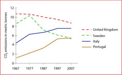
The Graph shows average carbon dioxide (CO2) emissions per person in the United Kindom, Sweden, Italy and Portugal between 1967 and 2007.
The given chart illustrate how the amount of CO2 discharged by individuals in 4 seperate countries differ in a 40-year period from 1967 to 2007. All the statistics are given in metric tonnes. It can be clearly noted that all the figures underwent dramatic changes and after 40 years, the rankings of these 4 nations were not the same as the original.
Starting at nearly 2 metric tonnes at the beginning of the process, Portugal's CO2 emissions per person witnessed a substantial rise to oveer 2 and approximately 4 tonnes in 1987. Quite similarly, in Italy, each citizen released more CO2 into the atmosphere as time passes when the figure increased by 2 metric tonnes after 10 years. In contrast, while Britain had their levels reduced gradually to precisely 10 tonnes in that same period, Sweden's figure had soared to over 10 tonnes before experiencing a remarkable fall by almost 3 tonnes in 1987. From 1987 on, this trend continued and therefore resulted in the variation of positions. Even though CO2 emissions kept on falling slowly and steadily by nearly 1 ton per 10 years in Britain, the country still ranked the first with over 8 tonnes of emissions. Both Italy and Portugal had a regular increase and both reached its peak in 2007 with nearly 8 tonnes and 6 tonnes, respectively. Meanwhile, this in Sweden plummetted to a bottom of 5 tonnes, which is exactly the same as Portugal.
Band 7+ eBooks
"I think these eBooks are FANTASTIC!!! I know that's not academic language, but it's the truth!"
Linda, from Italy, Scored Band 7.5


