IELTS Line Graph - Acid Rain Emissions
by Tam
(Vietnam)

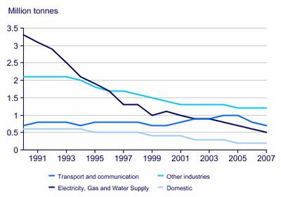
The graph below shows UK acid rain emissions, measured in millions of tonnes, from four different sectors between 1990 and 2007
Hi guys, I need your help with my Task 1. Thank you very much.
The line graph compares four distinct fields from which the amount of acid rain pounding out in England from 1990 to 2007.
Overall, it seems that most of acid rain emissions in these sectors diminished over this period, with a noticeable exception of the fluctuation in the data of transport and communication.
In terms of clear downturns, although representing the highest of about 3.3 million tones in 1991,the figures for electricity, gas and water supply slumped to a mere 0.5 million tones 16 year later. Besides, there was a slight decrease in the amount of acid rain regarding other industries, which surpassed 1.7 million tones of mentioned energy productions in 1996 in order to account for 1.2 million tones in the end of the period.
Apart from this, making up the lowest at 0.7 million tones in the beginning, domestic sector experienced a continuing steady downward trend to just 0.3 million tones, while negligibly having higher by around 0.1 million tones, the data of transportation and communication reached 0.8 million tones, being considered as the runner-up in 2007.
Comments for IELTS Line Graph - Acid Rain Emissions
|
||
|
||


