- Home
- Sample Graphs
- Ielts Bar Chart
Sample IELTS Bar Chart
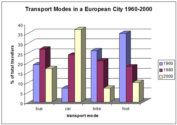
This is a sample IELTS bar chart showing the different transport modes used in a European city.
You will notice that there is a time frame. This means that you will need to use the language of change and the language of comparison and contrast.
You should spend about 20 minutes on this task.
The following bar chart shows the different modes of transport used to travel to and from work in one European city in 1960, 1980 and 2000.
Summarize the information by selecting and reporting the main features and make comparisons where relevant.
Write at least 150 words.
IELTS Bar Chart - Model Answer
The bar chart shows the changing patterns of transport use in a European city during the period from 1960 to 2000. In brief, the chart shows that the use of the car as a means of transport dramatically increased over the period shown, while the others fell.
In detail, in 1960 the motor car was used least as a method of transport with only about 7% of the population using this method but car use grew steadily and strongly to finally reach about 37% of the population by 2000. This was a massive 5-fold increase in use.
Over this same period, however, the popularity of walking, which had been the most popular means of transport with 35% of the population in 1960 having it as their preferred way of getting around, fell to 10%. Bicycle use also fell from a high of about 27% in 1960 to just 7% in 2000.
On the other hand, bus use was more erratic being popular with almost 20% of the population in 1960 and rising to a peak of about 27% in 1980 before falling back to about 18% in 2000.
(188 Words)
Comments
This IELTS bar chart would get a good score as it meets the requirements of the task.
You have to think carefully how you will organise your it as there are usually a few options.
For example, in this case organising by years or by modes of transport are two possible options. In the IELTS bar chart response, it has been organised by mode of transport, with each discussed in turn.
Good organisation is essential for a high score as without it the examiner may get confused as they read it, thus affecting your score for coherence and cohesion.
You must also make sure you refer to the data now and again to support your analysis, and make sure you vary the language used.
There are several examples in the IELTS bar chart of the language of change used well:
- car as a means of transport dramatically increased over the period shown, while the others fell.
- motor car was used least
- car use grew steadily and strongly
- massive 5-fold increase in use.
- popularity of walking fell to 10%
- bus use was more erratic
- rising to a peak of about 27%
You must also make sure you have complex sentences and structures in your description.
Learn more about using the language of change and the language of comparison and contrast.
Comments
Any comments or questions about this page or about IELTS? Post them here. Your email will not be published or shared.
Band 7+ eBooks
"I think these eBooks are FANTASTIC!!! I know that's not academic language, but it's the truth!"
Linda, from Italy, Scored Band 7.5
