IELTS Computer Delivered Tests + Band Score

IELTS Bar Chart - Proportion of City Populations

Percentage of City Populations

Percentage of City Populations

Hi,

I have been studying for the IELTS for over a year now, and my reading and listening is acceptable (estimated to be 8.0+), but my writing has been stagnating at 5.5. :(

Can anyone give me some suggestions?

Here is a task 1 essay by me:


***


The bar chart gives information about the percentage of the population living in urban areas in different parts of the world.

Summarise the information by selecting and reporting the main features, and make comparisons where relevant.


The bar chart illustrates the proportion of urban residents in six different areas of the world in 1950, 2007 as well as projections to 2050.

It can be seen that the proportion of the world's population living cities will have increased between 1950 and 2030. However, the change is more pronounced in regions than others.

For example, rapid urbanisation is expected in Africa and Asia, whose urban population is estimated to rise from just around 15% in 1950 to over 60% in 2050. The proportion of city dwellers in Ocenia, on the other hand, only saw a modest rise from 62% in 1930 to 71% in 2007, and is estimated to be just around 76% in 2050.

In Latin America and the Caribbean, only 42% of people were living in cities in 1970, a little less that the figure for Europe , which is at 51%. By 2007, however, the the latter had been surpassed by the former by around 4%, and this trend is expected to continue to 2050. Finally, North America is consistently the most urbanised region in the world from 1950 (64%) to 2050 (90%)

***


It took me a very very long time to finish this one, because I did not know how to structure the essay, you know what should i describe in the 2nd part, so on and so on. And I can't seem to think of any idea!! :(

Comments for IELTS Bar Chart - Proportion of City Populations

Click here to add your own comments

Sep 16, 2016
Suggestions
by: Anonymous

Hi,

If I may suggest, omit numbers or have it reduced and instead use descriptors like doubled the number, tripled, half of, and so on.

Mar 06, 2017
Need improvements
by: AWEAS

a few mistakes that i noticed:

"as well as projections to 2050." - I couldn't find 2050 anywhere in the graph, i believe this to be an inaccuracy.

"will have increased between 1950 and 2030". It should either be "will have increased by 2030", or "increased from 1950 to the 2007 and is predicted to have increased by 2030"

Reading the third paragraph, i figured that you either gave us the wrong graph,( or a wrong graph is being displayed on my screen), or something else is going seriously wrong. Africa and Asia, despite having similar trends, have different figures, starting from 1950, Africa has 15% of its population living in urban areas, while the number is 17% for Asian, you can group them to write about their overall trend, but can't use a made up figure to describe them both. Continue on, the 60% in 2030 seems to be the world's figure instead of either Africa or Asia, as the figure are 51% and 54% respectively for the regions. After that, I couldn't find Oceania anywhere on the graph, for this, i'm assuming that a part of the graph was cut off.

For the last paragraph:

"In Latin America and the Caribbean, only 42% of people were living in cities in 1970, a little less that the figure for Europe , which is at 51%. By 2007, however, the the latter had been surpassed by the former by around 4%, and this trend is expected to continue to 2050. Finally, North America is consistently the most urbanised region in the world from 1950 (64%) to 2050 (90%)"

42% was 1950's number, not 1970.
Corrections: a little less than the figure of Europe, which was 51%.
By 2007, however, the the latter was surpassed by the former by around 4% ("had been" means that the surpassing happens before 2007, we don't have that information). Latin and Caribbean also is expected to continue to lead Europe in urbanisation with 84% comparing to 78% of Europe in 2030 (talking about trend seems to be unclear and missing out data in this case, imo).


Other comments:
- You missed Latin & Caribbean when grouping the group with rapid urbanisation, and didn't notice that North America and Europe shares similarities , you could have grouped L&C, Africa, Asia in to a group and NA, Eu into another group and compared them. As you missed that opportunity, NA described in your last sentence seems out of place and awkward, while the slower urbanisation in developed regions is omitted.


Click here to add your own comments

Join in and write your own page! It's easy to do. How? Simply click here to return to IELTS Graph Feedback Forum.


IELTS Bar Chart - Percentage of Population in Urban Areas

by Cher
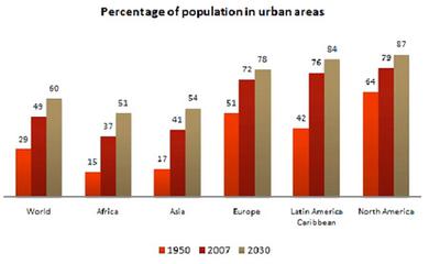
The bar chart gives information about the percentage of the population living in urban areas in different parts of the world.

The bar chart gives information about the percentage of the population living in urban areas in different parts of the world.

Summarise the information by selecting and reporting the main features, and make comparisons where relevant.

The bar chart shows the percentage of the population living in six different regions of the world in three different years.

In 1950, North America had 64 per cent of people living in the cities, reaching 90 per cent by 2050, makes it the highest percentage of population compared to other areas. By contrast, Africa had 15 per cent of citizens living in urban areas in 1950, which is the lowest percentage compared to the other regions of the world; however, it had the greatest change from 1950 to 2050, quadrupled from 15 per cent to 62 per cent. Moreover, Asia also had similar pattern of changes as Africa, increasing from 17 per cent in 1950 to 66 per cent in 2050. On contrary, Oceania has the least changes of percentage from 1950 to 2050; the difference is only 14 per cent. Moreover, the percentage of people who lived in Latin America and Caribbean has doubled from around 40 per cent to 80 per cent over a century.

In conclusion, it is clear that the percentage of population in urban areas in six parts of the world has increased over a hundred year. However, these percentages change at the different rates for each city.

Comments for IELTS Bar Chart - Percentage of Population in Urban Areas

Click here to add your own comments

Mar 18, 2015
bar chart with percentage living in urban area in six regions
by: Florence

1. Good introduction and conclusion

2. The body should have been divided into two paragraphs may be pg1-the two developing countries with lowest count then pg2-The three developed countries

3. 2007 data and the world data should be included in the write up some how it was completely ignored.Make your sentence shorter to accommodate this.

4. The figures were not the same as on the chart even if rounding up use about around.Let your write be a picture that can be drawn without looking at the original chart if possible.

5. Look at your tenses some are missing,some need correction

6. Use what is on the chart what is Oceanian?

7. Description good but not detailed.

8. Word count is good

Click here to add your own comments

Join in and write your own page! It's easy to do. How? Simply click here to return to IELTS Graph Feedback Forum.


Band 7+ eBooks

"I think these eBooks are FANTASTIC!!! I know that's not academic language, but it's the truth!"

Linda, from Italy, Scored Band 7.5

ielts buddy ebooks