IELTS Computer Delivered Tests + Band Score

Owned and Rented Accommodation

by Chandni Kayastha
(Kathmandu, Nepal)

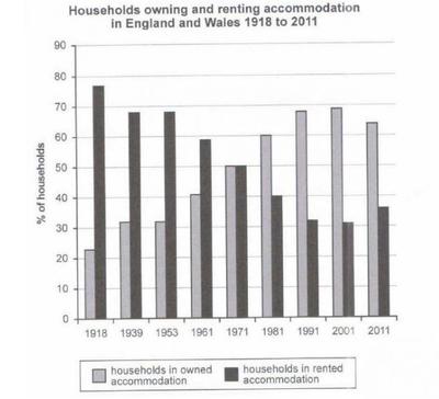
The chart shows the percentage of households in owned and rented accommodation in England and Wales between 1918 and 2011

The chart shows the percentage of households in owned and rented accommodation in England and Wales between 1918 and 2011

The bar graph shows the percentage of households owned and rented accommodation in England and Wales between 1918 and 2010.

In England, people are gradually shifting towards the owned house as we can see the percentage of household in owned accommodation is in increasing trend whereas of rented accommodation the percentage is declining. Moreover, in the late 20th century, the percentage of the household for both the year is equal. We can also notice a little fluctuation in the percentage of households for both of the accommodation in the later years.

With regard to owned accommodation, the first 35 years were very challenging. The proportion of household for rented apartments for these years was around 70% while owned housing was only about 20% to 30%. The year 1971 was a game changer as a household for both the accommodation came into equilibrium reaching 50%.

In contrast to the previous, years, people start preferring own house rather than rented which reduced to 40% in 1981 followed by approximately 30% in 1991 and 2001. However, 2011 experienced a little variation in the percentage of both the accommodation, with around 5% increment in rented and the same percentage reduction in owned accommodation.

Comments for Owned and Rented Accommodation

Click here to add your own comments

May 15, 2020
my answer
by: Anonymous

The given bar chart illustrates the ratio of households who lived in owned and rented accommodations in England and Wales from 1918 to 2011.

Overall, The percentage of British citizens who used to live in rented accommodation decreased with respect to time. In contrast, The rate of people who lived in owned accommodation increased at a given time duration. Moreover, 1971 was the year when both types of residential accommodation's popularity were equal (50%).

It is observed from the bar chart that initially, more than 70% of citizens lived in rented accommodation while only just over 20% of the British used to stay in owned accommodation in 1918. The popularity of owned residential facilities hiked up to 1971 and the preferences of rented living amenities diminished in same time. In 1971, the same number of people lived in owned and rented houses. Furthermore, the past trend was continued up to 2001 in both types of housing facilities. In last year, minimal decrement observed in the popularity of owned housing amenities and slight increment noticed in preferences of British toward rented accommodations.

Jul 23, 2020
IELTS Bar Chart
by: Larissa

The bar chart provides information about the rate of own and rent accommodation in England and Wales from 1918 to 2011.

Overall, there is an inversely trend between both kind of accommodation which is expressed by "X" shape. While households owning accommodation increased constantly, households renting felt during the years surveyed. Also, in the middle of the graph, the two sorts of accommodation had the same percentage.

According to the picture, in the beginning, households in owned accommodation had only about 22% of people in this category. However, throughout the years the percentage rose almost 10% in each year until 2001, but not between 1939-1953 and 1991-2001 which the rate remained. In addition, the last 10 years surveyed the number of owner accommodation decreased slight and presented around 60% of households.

In terms of households in rented accommodation, in 1918 it started with almost the quadruple more than households in owned accommodation (just over 80%). However, after this year the percentage decreased rapidly and in the 70th decade both categories studied had equal percentages, 50%. Moreover, from 1971 to 1981 the rate felt to exactly 40% and ten years later it was around 32% which practically unchanged in 2001. On the other hand, the percentage rose gently to around 38% in 2011.

Oct 24, 2020
Task 1
by: Anonymous

The below chart illustrated buying and renting accomodation percentage of houshold in England and Wales in the time period between 1918 and 2011.

From the bar chart it is observed that, in 1918 the houshold in rented accomodation position is significantly higher (value showed 78 percent approximately) than the buying accomodation (value shoed 22 percent approximatey). On the otherhand the value for both buying and rented is level in same between the time period of 1939 and 1953. Apart from this, in 1961 the scnario is opposite then previouse two year. Here, rented shoed 59 percentage wheras owned showed 40 percentages. In 1971 the value is leveled same for both criteria ( 50 percentage) .

In contrast , from 1981 to 2001 the value of rented is declined gradually but in 2011 the value is reversed from previouse consecutive years. In 1981 the buying value was 60 % wherease the rented value was 40 %. Buying value were 68 %, 69 % & 64 % approximately wherase rented value were32, 31 & 37 % approximately from consecutive three years.

Eventually, both the buying and rented value was droped and raised throut the year four consecutive year from 1918 to 1961 and 1981 to 2011. Wheras the scenerio is different for 1971 where both the value is same which represented 50 precentage.

Oct 30, 2020
Task 1
by: Anonymous

The bar chart illustrates how the rate of households in owned and rented accommodation changed in England and Wales from 1918 to 2011. Overall, it can be seen that the rate of rented accommodation decreased over the 50 years, whereas the rate of owned accommodation increased consistently in England and Wales from 1918 to 2011.

According to the chart, about 75% of households settled in rented accommodation in 1918 and it was the highest rate in England and Wales. However, the rate of households in rented accommodation decreased steadily from 1918 to 1971. In 1939 and 1953, %68 of households were staying rented accommodation. In 1961, 59% of households lived in rented houses. Moreover, the rate of rented accommodation reached an equal rate with the owned accommodation rate in 1971. These decreases continued until the end of the period was given. It hit to %35 in 2011

Contrary to rented accommodation, over %20 of households accommodate in own houses in 1918. Nevertheless, rates rose consistently from beginning to end. In 1961, 40% of households in England and Wales had their own houses to accommodate. After 1971, the rate of households in owned accommodation surpassed the rate of households in rented accommodation. The highest rate of owned accommodation was about 69% in 2001.

Feb 20, 2021
mcswwong@gmail.com
by: Lee Ma Ma

The bar chart titled "Households owning and renting accommodation in England and Wales 1918 to 2011" shows how the 100 percent of households is shared between owned and rented accommodations from Year 1918 to 1953 roughly at 20-year intervals and then at decade intervals up to Year 2011.
The bar tops of households in owned accommodation slope up linearly from 22% in Year 1918 to the peak of 70% in years 1991 and 2001, which are identically mirrored by those in rented accommodation sloping down from 78% to the bottom of 30% at the same time interval with bar tops of both accommodations levelled off each other 50-50 in Year 1971. The mirroring slopes run smooth just except for the 20-year interval from 1953 to 1939 when both types of accommodation data imitated each other correspondingly.
Initially in Year 1918 the popularity of 22% households in owned accommodation hiked up to the peak of 70% hovering in years 1991 and 2001 with a minimal decrement to 65% in Year 2011 at the end. Meanwhile the mirroring data had 78% household used to live in rented accommodation slide down to the bottom of 30% lying in years 1991 and 2001 with a slight increment to 35% at last.
207 words

Nov 23, 2021
The chart below shows ther percentage of households in owned and rented accommodations in england and wales between 1918 and 2011
by: Anonymous

The given chart demonstrates the share of houses owned and rented by the families in England and Wales during the year 1918 to 2011. Overall, it is evident that owning household shows a rising trend while rented household experience a downfall over the period of the time.

In 1918, around 20% of houses was owned by families, which increased to slightly above 30% in year 1939 and remain same for next fourteen years. However, it rises by 10% in both years 1961 and 1971, and contributes 50% of total numbers of accommodations and this incremental rising trend continues in following years till 2001 with total numbers reached near 70% but it experience a slight downfall in year 2011 with total owned households comprises about 65%.

On other hand, the rented accommodations in year 1918 was all time high with more than 75% of shares in total numbers but it slightly decreased below 70% in year 1939 and remain stagnant till 1953, and again experience a downfall of nearly 10% in 1961. The rented houses became equal to owned ones in year 1971. However, in coming years, the downfall of rented properties continues and reaches to all time low in year 2001. While in 2011, there is again slight positive reinforcement in rented household shares.

Feb 07, 2022
prashant
by: Anonymous

The bar diagram illustrates the percentage of households in rented and owned accommodation in England and Wales from 1918 to 2011.

Overall, the household in owned accommodation experienced an upward trend while rented accommodation showed a downward trend throughout the period. Although owned housing initially had a lower percentage at the beginning of the year, it outraced rented accommodation at the end of the period.

To begin with, in 1918, the highest percentage of people prefer to live in rented accommodation which comprises at under 80% of household and observed fluctuation till 1971, it accounted for 50% of households. The figure dropped slightly until 2001 and remained over 30% and showed a gradual increase till 2011, which is around 36% of household.

On the other hand, the owned accommodation was not popular among an individual that is less than 30% at the beginning of the year 1918 which rose with fluctuation till the year 1971, accounted for 50% of household. Referring to 2001, the percentage of a household was under 70% which decline slightly throughout the period and remained at around 65% in the year 2011.

Jun 02, 2023
Rate this summary.
by: AH Rahat

The given bar chart illustrate the proportion of households in owned and rented accommodation in England and Wales from 1918 to 2011.
Overall, accommodation of owned households was increased in England, whereas, it was decreased on rented households over the given period.
In 1918, accommodation of owned households was at around 23%, which was inclined at almost 32% in 1939, and it was stayed same over 13 years. Than it was inclined 50% in 1971. Coincidentally accommodation of rented households was same at 50% in 1971. And after 40 years, in 2011, accommodation of owned households inclined almost 65%.
Moreover, accommodation of rented households was the highest in 1918 at almost 78%. Which was decreased at 50% over 53 years latter. And it was slowly slowly decreased over the given period, and at last it was finished at around 38% in 2011.

Jan 01, 2024
J
by: Deepak

User
The bar graph shows the percentage of households owned and rented accommodation in England and Wales between 1918 and 2010.

In England, people are gradually shifting towards the owned house as we can see the percentage of household in owned accommodation is in increasing trend whereas of rented accommodation the percentage is declining. Moreover, in the late 20th century, the percentage of the household for both the year is equal. We can also notice a little fluctuation in the percentage of households for both of the accommodation in the later years.

With regard to owned accommodation, the first 35 years were very challenging. The proportion of household for rented apartments for these years was around 70% while owned housing was only about 20% to 30%. The year 1971 was a game changer as a household for both the accommodation came into equilibrium reaching 50%.

In contrast to the previous, years, people start preferring own house rather than rented which reduced to 40% in 1981 followed by approximately 30% in 1991 and 2001. However, 2011 experienced a little variation in the percentage of both the accommodation, with around 5% increment in rented and the same percentage reduction in owned accommodation.
Using simple words and give best answer in 170 words

ChatGPT
The bar graph illustrates the ownership and rental trends of households in England and Wales from 1918 to 2010. Over time, there is a noticeable shift towards owned accommodations, with a rising trend and a corresponding decline in rented homes. In the late 20th century, both types of housing reached parity.

Initially, from 1918 to 1953, rented homes dominated, comprising around 70% of households, while owned houses lagged behind at 20-30%. The pivotal year of 1971 marked a turning point, bringing both to an equal 50%.

Subsequently, the preference for owned homes increased, with a decline in rented percentages to 40% in 1981, approximately 30% in 1991 and 2001. However, 2011 saw a slight shift, with a 5% increase in rented and an equal decrease in owned accommodations, signaling a nuanced change in housing patterns.

Click here to add your own comments

Join in and write your own page! It's easy to do. How? Simply click here to return to IELTS Graph Feedback Forum.

IELTS Bar Chart - Owning Renting Accommodation


The chart below shows the percentage of households in owned and rented accommodation in England and Wales between 1918 and 2011.

Summarise the information by selecting and reporting the main features and make comparison where relevant.

The bar chart compares the proportion of families who owned and rented accommodation in the UK and Wales over the period of 93 years, from 1918 to 2011.

Overall, it is transparent that while during the first half of the period, the percentage of households in rented accommodation was higher than that of people who lived in their own houses, the opposite trend was observed in the rest of the time.

In 1918, the figure of families in rented accommodation stood at over 75%, tripled that of who lived in owned accommodation. However, after a gradual decrease, this figure dropped to 50% in 1971. In contrast, the number of people living in owned houses increased steadily over the years until accounting for the similar percentage as those living in rented places.

The proportion of households in rented accommodation continued to decline marginally during the following years. After reaching its lowest point at 31% in 2001, there was a small rise by 5% in its data in 2011. Nevertheless, a different pattern was seen in the percentage of families in owned accommodation, which the number of people living in their houses grew slightly from 50% to 69% during the period of 30 years from 1971 to 2001 before went down to 64% in 2011.

Comments for IELTS Bar Chart - Owning Renting Accommodation

Click here to add your own comments

Aug 04, 2020
Years calculation
by: Snehal

How u calculated 93 years plz explain...from 1918 to 2011?

Nov 08, 2020
How 93 years is considered
by: Anonymous

2011-1918 = 93 years

May 14, 2021
My variant of that task 1
by: kamila dzhalalova

The given bar chart illustrates index about individuals that resided in rented and owned accommodation over the period of 93 years in England and Wales.
It is interesting to note that rented house were the most demanding way at the beginning of 20th century. However, the owned method witnessed a real let down and people were tend to not purchasing accommodation.
As can be seen from the chart, households in owned houses made a percentage around 20 % and 30 % for over 43 years. At the same time, rented method was twice more demanded, having fluctuated around 65 %. However, in 1971, both ways of the accommodation remained the same with the percentage of 50 %.
What is more, at the end of 20 th century, the growth of owned house slightly increased showing proportion as 60 % and 70 % from 1981 to 2001. Therefore, the figure of rented house suffered a decline, starting from 1981 to 2001. By contrast, in 2011, the development of rented house marginally grew, whereas individuals that bought their own apartment showed inconsiderable fall.

Feb 07, 2023
Bar chart
by: Shuvankshi

The chart depicts the information percentagewise of household in England and Wales about inherited and rented housing between the year 1918 and 2011.

Overall it can be clearly seen the increment of owned accommodation between these years and declining of percentage for rented housing.While to the suprise there is slight increase in percentile of rented house and decrease in percent of owned house.

From year 1918 to 1961 the massive percentagewise change has been shown in both rented and owned amenities. However rental accomodation percent kept on dropping as opposed owned accommodation took a baby steps rosing from around 20% to around 41%.

Year 1961 was a game changer as both household amenities clashed into equilibrium reaching 50%.In comparison to previous year people preferred owing houses from which percentage of 60 rose to around 70 in last 2 decades. Nevertheless people choice for rental house kept on reducing from exactly 40 percent to approximately 30. In the year 2011 there seemed to be little variation on both housing while rental house increase around 5% whereas there was 5% declination in owned amenities.

Click here to add your own comments

Join in and write your own page! It's easy to do. How? Simply click here to return to IELTS Graph Feedback Forum.


Band 7+ eBooks

"I think these eBooks are FANTASTIC!!! I know that's not academic language, but it's the truth!"

Linda, from Italy, Scored Band 7.5
ielts buddy ebooks