- Home
- Sample Graphs
- Sample Line Graph
IELTS Sample Line Graph
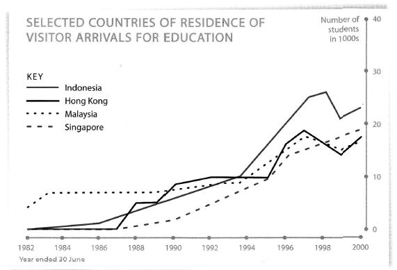
This IELTS Sample Line Graph is about overseas visitors to Australia and the countries that the visitors originate from.
It's important in a line graph that you select and report the main features but you should not write about every single change that takes place. You must also make comparisons.
Organising your answer
You need to ensure your answer is well-organised otherwise the examiner will get lost as they try to follow what you have written.
So keep it simple and coherent.
To do this look for ways in which you can link similar things together and highlight differences.
Also, try to just write about each category (countries in this case) in chronological order as this is much easier to do for you and for someone who is reading it to understand.
Now take a look at the IELTS sample line graph and see how it has been organised.
Model Answer
You should spend about 20 minutes on this task.
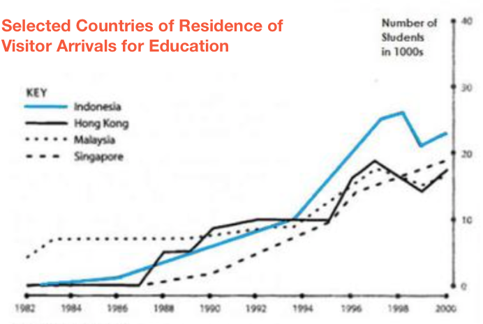
The graph below shows four countries of residence of overseas students in Australia.
Summarize the information by selecting and reporting the main features, and make comparisons where relevant.
Write at least 150 words.
IELTS Sample Line Graph Model Answer
The line graph illustrates the changing trends in the numbers of students, in 1000s, who visited Australia for education from four different countries between 1982 and 2000. Overall it is evident that visitor numbers from all four countries increased over the time period.
At the start of the period, while Malaysia had around 5,000 students per year visiting Australia, the other countries had none. However, though remaining at the highest number up until 1990 and increasing after this, visitors number from Malaysia finished at the lowest levels of all the countries, at around 18,000.
The lack of student visitors continued for Hong Kong and Singapore up until 1987. At that point arrivals from Singapore gradually increased over the years, culminating in nearly 20,000 visitors per year in 2000, while arrivals from Hong Kong showed a more erratic pattern, fluctuating after 1996 and finishing at 19,000 per year.
However, the biggest change was seen in numbers coming from Indonesia. Though this started low, arrivals kept increasing over the years. Numbers peaked in 1998 at approximately 28,000, before dropping to final arrival numbers of 23,000, which exceeded all the other countries.
(189 Words)
Comments
This IELTS sample line graph is a good and well-organised answer.
The writer has first identified the similarities and differences at the beginning, noting how one country began with more student visitors than the other three, all of which were the same (no visitors).
This is good because you must compare and contrast the differing trends.
To keep it easy to read, it firstly just focuses on Malaysia, before moving on in the next paragraph to discuss Singapore and Hong Kong.
They are grouped together in one paragraph discussion as they follow the same pattern at the beginning, though they later diverge, which is noted.
Indonesia is then discussed on it's own, as this started so low but overtook all the others.
Important:
There is not one way to discuss a graph. This IELTS sample line graph answer is just one way you could approach it but there are a variety of other ways you could have done it.
What is very important though is that you do it in a logical way, drawing out the key trends and changes, and ensuring it is easy to read and follow.
Comments
Any comments or questions about this page or about IELTS? Post them here. Your email will not be published or shared.
Band 7+ eBooks
"I think these eBooks are FANTASTIC!!! I know that's not academic language, but it's the truth!"
Linda, from Italy, Scored Band 7.5
